Sharp Frame Media needed a refreshed website that better supported modern browsing habits, particularly for users accessing the site on mobile devices. The project focused on redesigning the website with a mobile-first approach, improving usability, accessibility, and performance while making it easier for potential clients to learn about services and get in contact.
The Problem
The existing site experience did not fully prioritize mobile users, which limited usability and engagement for visitors browsing on smartphones and tablets. Navigation and contact options were not as streamlined as they could be, making it harder for potential clients to quickly find information or reach out.
Key challenges included:
- Limited mobile optimization
- Navigation that could be simplified for smaller screens
- Contact options that were not immediately accessible
- Opportunities to improve overall performance and responsiveness
The Process
The redesign process began by evaluating the current site structure and identifying areas where the user experience could be improved. A mobile-first design strategy was used to ensure the website would perform well on smartphones while scaling effectively across tablets and desktops.
Key steps included:
- Simplifying page layouts and navigation
- Prioritizing essential content for mobile users
- Improving the visibility of contact and call-to-action elements
- Enhancing responsive behavior across devices
- Optimizing performance and load times
The Solution
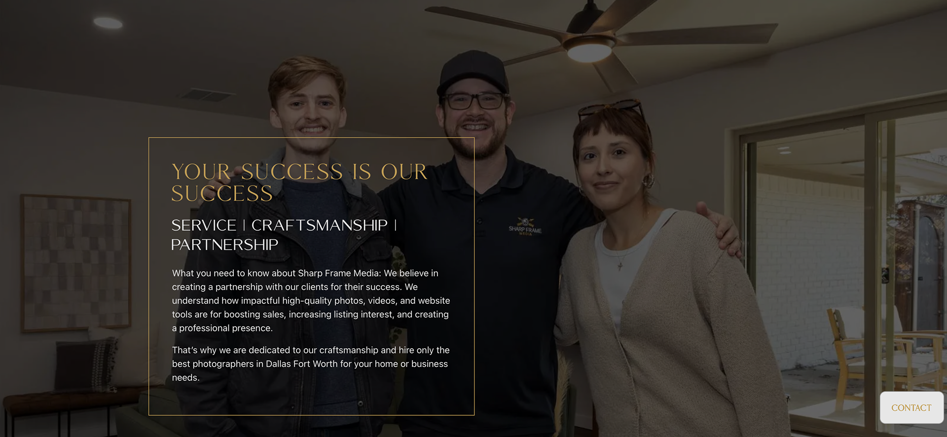
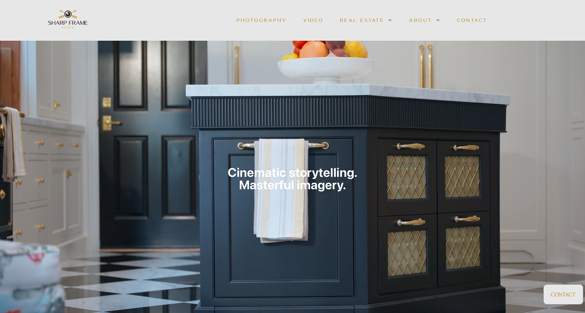
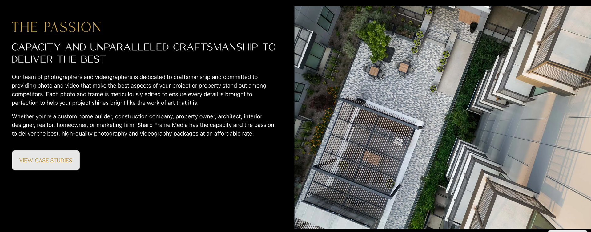
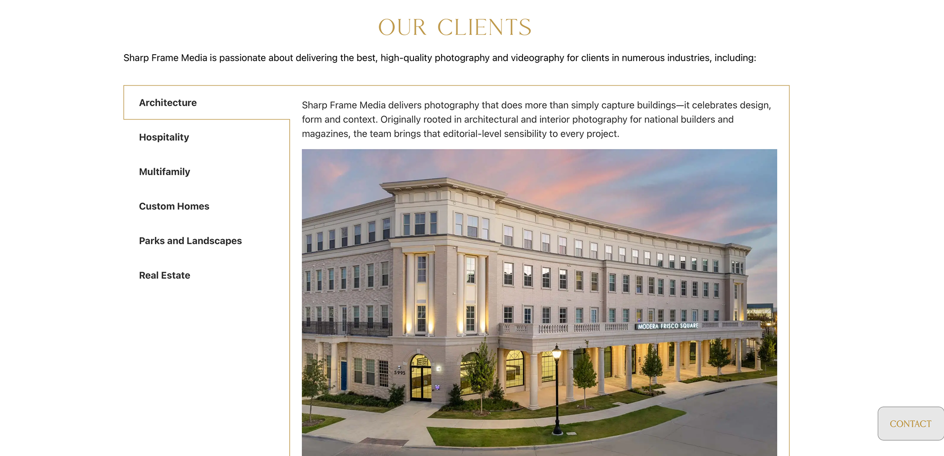
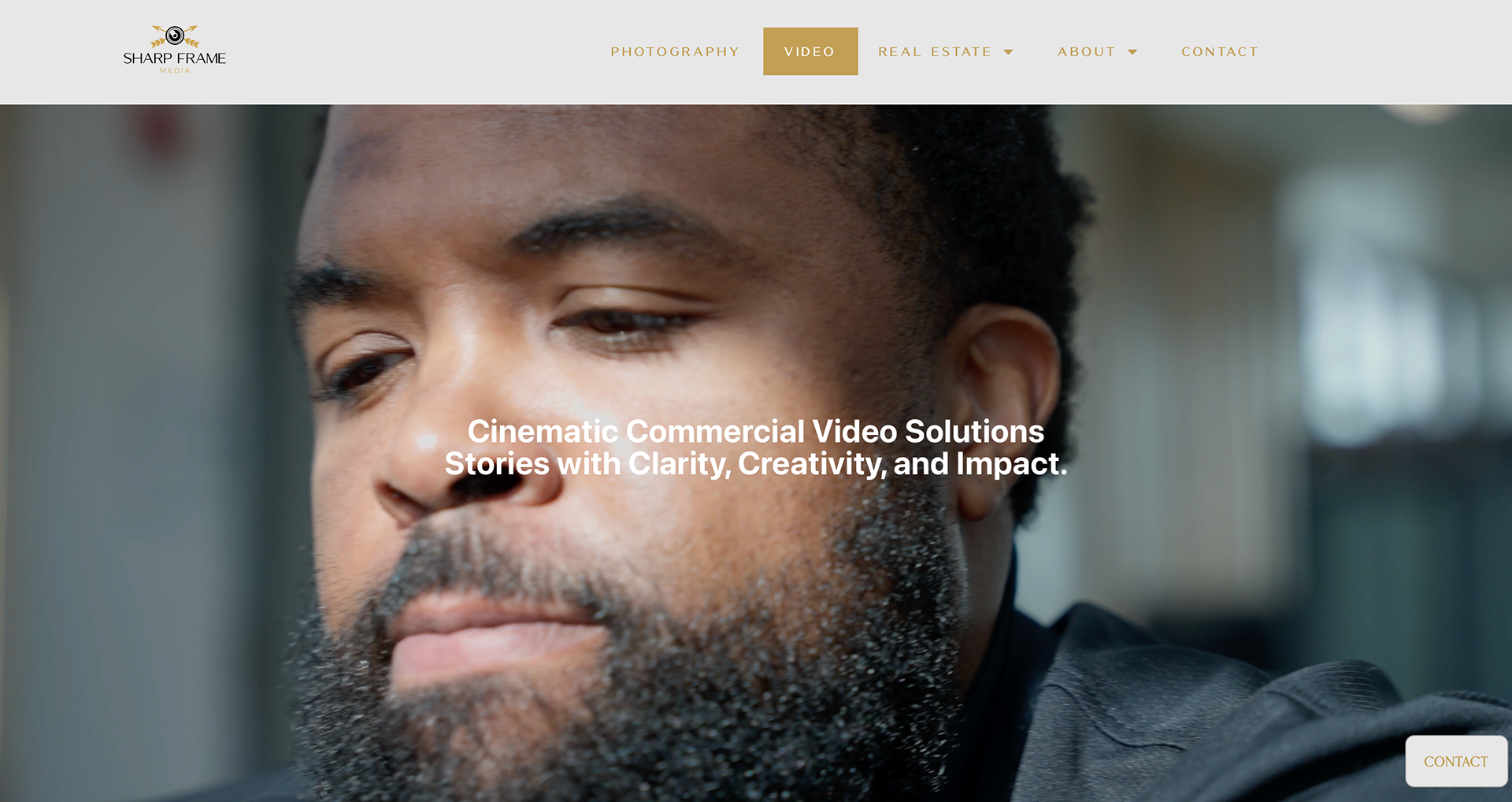
The redesigned website introduces a clean, responsive layout that adapts seamlessly to different screen sizes while keeping the most important content easily accessible.
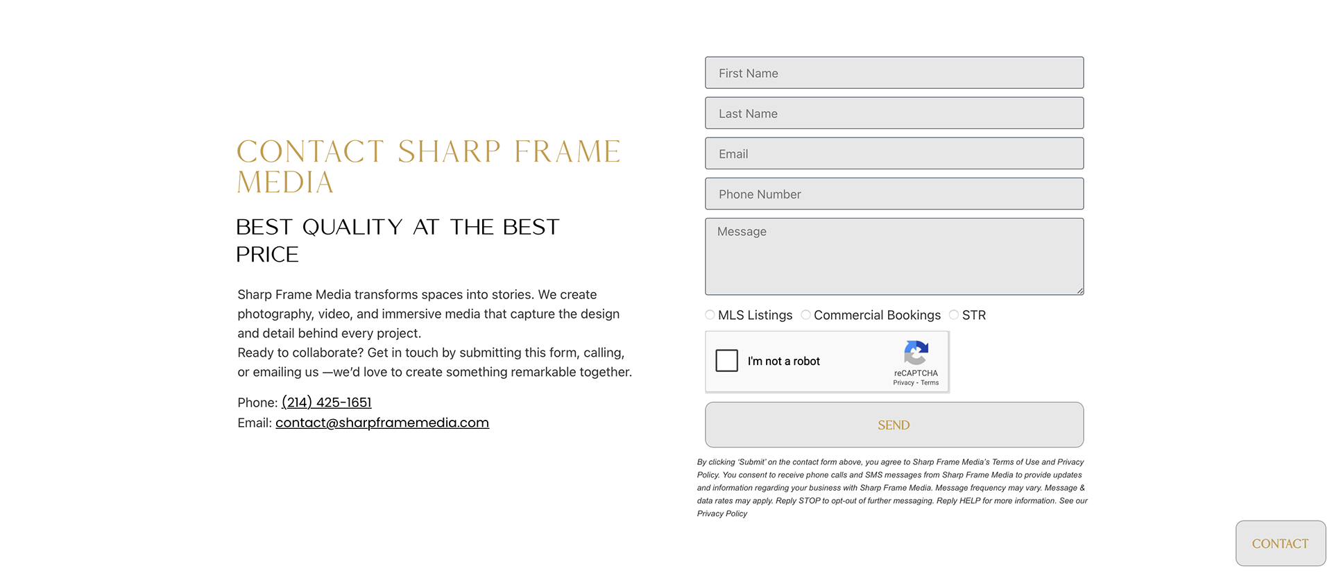
Contact functionality was improved by adding clear call-to-action sections and simplified contact forms, ensuring visitors can quickly reach Sharp Frame Media without navigating through multiple pages.
The updated structure also improves the user journey, helping visitors understand services and take action more quickly.
Results
The final result is a modern, mobile-friendly website that delivers a smoother user experience and makes it easier for potential clients to connect with Sharp Frame Media.
Improvements include:
- Stronger mobile usability
- Faster loading and optimized performance
- Clearer navigation and content flow
- More accessible contact options
- A cleaner, more professional presentation of services
Key Focus Areas:
- Mobile-first responsive design
- User experience improvements
- Performance optimization
- Simplified navigation
- Enhanced contact and inquiry options